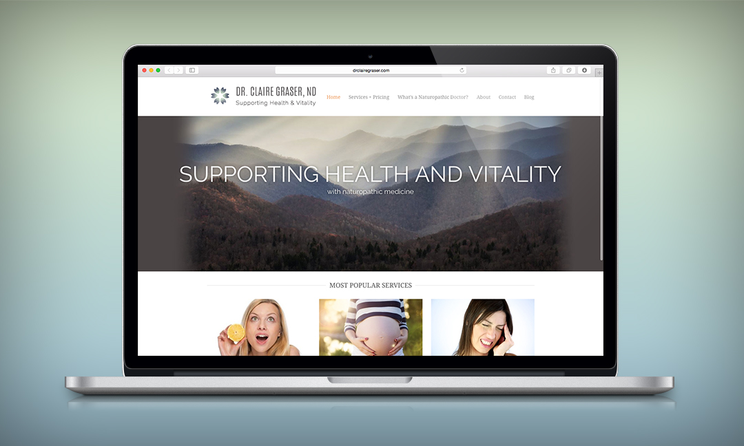
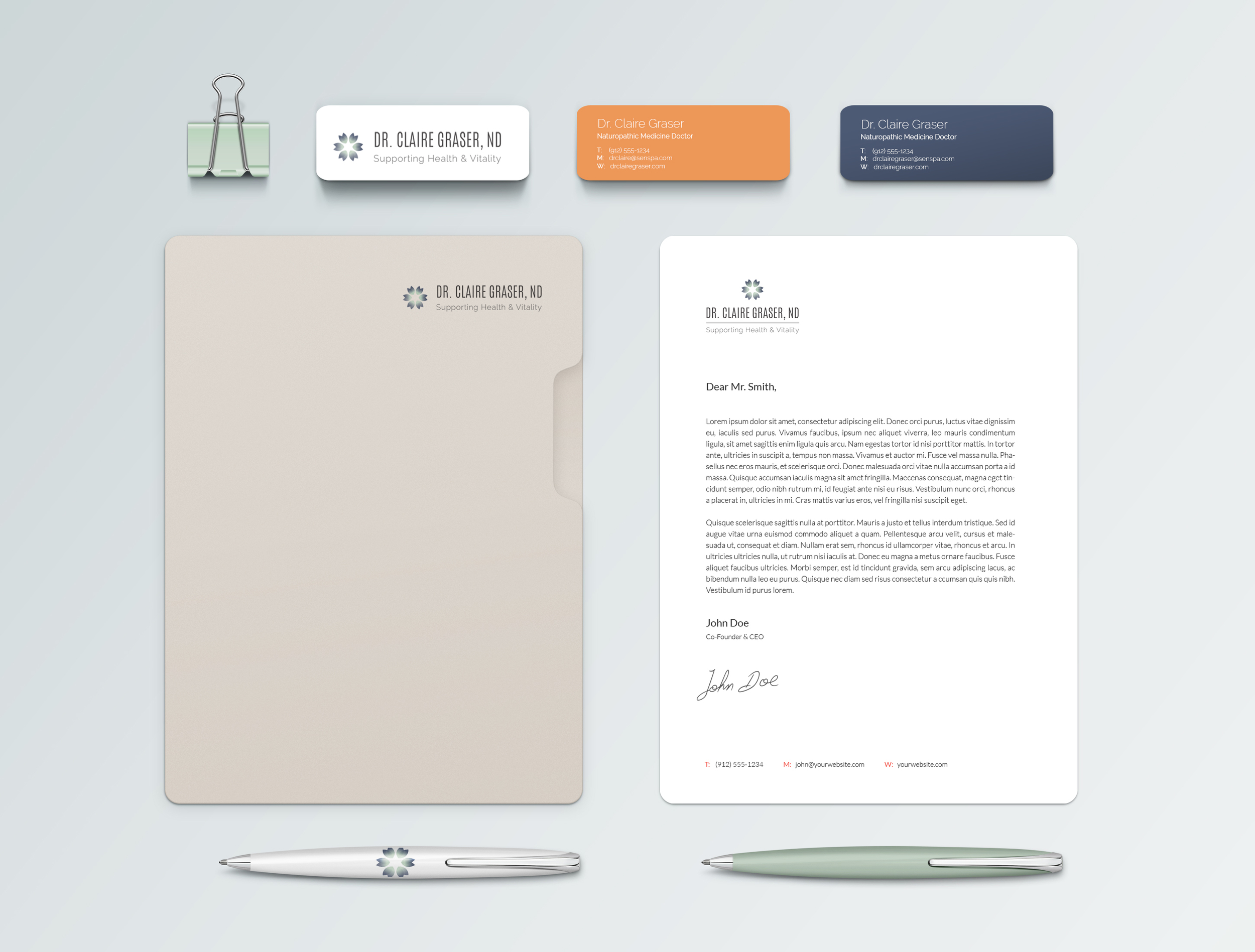
CULMINATING MATERIALS: Logo, 2 Logotypes, Typefaces, & Color Palette
MISSION STATEMENT: Provide holistic medical services to support women´s energy, vitality, positivity, physicality and long-term health. Enhance individual health to enhance family and community health.
DESIGN DRIVERS: Holistic, Medicinal, Vitality, Nature (botanical or biological), Healing
RESEARCH: Of the different holistic brands I studied I was most inspired by those with a clear and minimal aesthetic. Natrure inspired designs that used greens, tans, and browns felt redundant. Geometric symbols such as the flower-of-life represent life, balance, and union. With Claire's logo I combined geometric representation of a flower with a more botanical 6 point flower shape.
COMMUNICATION STRATEGY: Claire’s 6 areas of healing are vital to her brand. She specializes in Anti-Aging, Manual Therapy, Detoxification, Nutrition & Digestion, Hormone Balancing, and Women's Health. These assets are represented in the logo design through the number of combined petal groups. Together the grouped petals form a larger shape encompassing the principle of holistic health : emphasizing the organic or functional relation between parts and the whole.


